
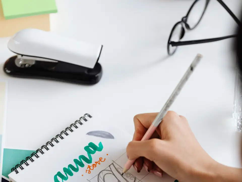
Lettering and wordmarks
Hand-drawn wordmarks digitised into clean outlines, so your name looks made rather than typed.
I design identities and packaging for food, drink and small consumer brands: the tin someone reuses for buttons, the label that still reads from two metres away on a crowded shelf. Eleven years in, I still begin every project standing in the shop where your product will sit.
Taking on two new packaging ranges for next spring.
We meet where the product will be sold, photograph the neighbours on the shelf and note lighting, price tickets and how high a hand reaches.
Buyer, moment of pick-up and the single promise the front panel must make in three seconds. You sign before any pencils touch paper.
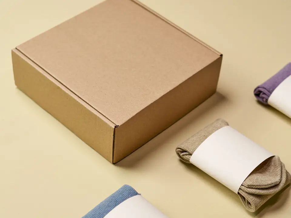
Not seven PDFs. Two directions printed at real size on the actual board stock so you can feel the weight in a trolley.
Folded prototypes live with your team for a week. Packaging is opened on a counter, not in a meeting room.
I am at the printer for the first run, comparing the sheet to the signed proof under the hall lights, not a laptop screen.
Most clients come for packaging and stay for the identity around it. Each piece can be booked on its own.
Hand-drawn wordmarks digitised into clean outlines, so your name looks made rather than typed.
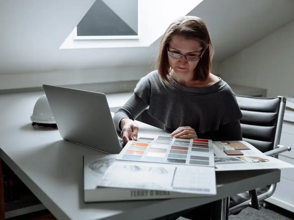
Paper stocks, inks and finishes chosen against your budget and your recycling claims, with printed samples to compare.
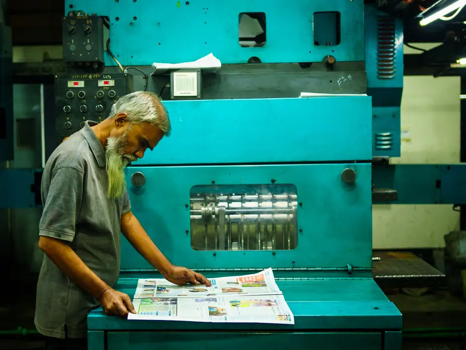
Dielines, proofs and supplier briefs handled for you, from the first quote to the pallet leaving the printer.
One grid that stretches from a 50 ml sample to a 5 litre refill without redrawing every size.
A short, visual guide your team actually opens, with do and do-not examples from your own shelves.
Shelf strips, crates and market banners that carry the packaging look into the room around it.
A few pieces from the last two years. Full case studies with sketches and costs are in the portfolio PDF.
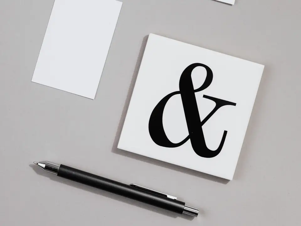
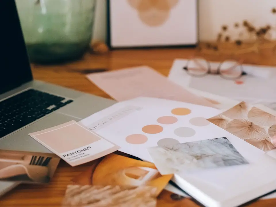
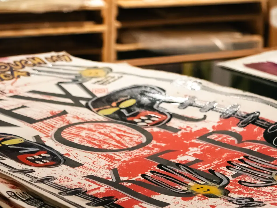
Filter by the shelf you are launching on. Each note says what the brief was and what changed on the shelf.
5 projects
A supermarket wanted its own label to stop looking like the discount shelf. One modular system now covers jams, pulses and frozen peas, and the range outsold the brands next to it in its first year.
Coffee cups, menus and a small wordmark for the café on a river ferry. The cup had to read in wind and spray, so the type is large and the colours few.
A family cannery wanted tins worth keeping. Each catch season gets its own illustrated wrapper, and collectors now ask for the full set.
A crowded fridge category. We dropped the gradient and gave each flavour one flat colour and a big number for its sugar content, which buyers now quote back to the founders.
Four years at a small branding studio before going independent: wine labels, a bookshop identity and the habit of always printing before presenting.
“Ines came to three of our shops before she opened her laptop. The labels she designed are the first thing our buyers mention.”
“She was at the press at seven in the morning arguing about our blue. The blue is right, and it is still right on the reprint.”
“Two routes, both strong, both thought through. We picked one in a single meeting, which has never happened to us before.”
Yes. About half of my clients are in Spain and the UK. Shelf visits happen on a short trip or through a local photographer.
A single product with one pack starts around six thousand euros. Ranges are quoted after the shelf visit, once I know how many sizes and stocks we need.
Of course. I send them a technical brief in the first week and join the press check either way.
You do, including the source files and the lettering, once the final invoice is paid.
Send me the product, the shop you dream of seeing it in and a rough budget. I will reply with honest timings.
Studio 3, Travessa dos Tipógrafos, Marvila, Lisbon
+1 (646) 555-0137